最近收到了一个实现目录的需求,并且文件夹之间有特定连接线的样式。项目中是纯 CSS 实现,性能优秀,所以有了这篇作为分享的文章
details 和 summary
首先,你得了解 details 和 summary 的用法,天然地支持内容展开和收起。这里有一个 MDN 的例子
1
2
3
4
5
6
7
8
9
<details>
  <summary>System Requirements</summary>
  <p>
    Requires a computer running an operating system. The computer
    must have some memory and ideally some kind of long-term storage.
    An input device as well as some form of output device is
    recommended.
  </p>
</details>
直接就实现了展开和收起

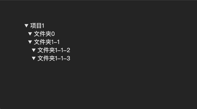
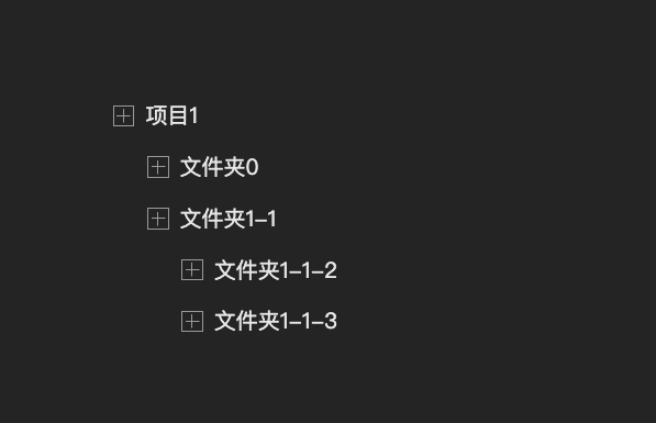
还可以支持多层嵌套,只需要将details当做展开的内容就行了,如下
1
2
3
4
5
6
7
8
9
10
11
12
13
14
15
<details>
  <summary>项目1</summary>
  <details>
    <summary>文件夹0</summary>
  </details>
  <details>
    <summary>文件夹1-1</summary>
    <details>
      <summary>文件夹1-1-2</summary>
    </details>
    <details>
      <summary>文件夹1-1-3</summary>
      ...
  </details>
</details>
这样就得到了一个简单的树状结构

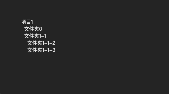
添加缩进后会更加清晰
1
2
3
details {
  padding-left: 10px;
}
绘制加号和减号
首先,默认的黑色三角太丑了,需要去掉。现代浏览器中,这个“黑色三角”其实是 ::marker 生成的,而这个 ::marker 是通过 list-style 生成,所以要去除就很简单了
旧版本浏览器需要通过专门的伪元素修改,
::-webkit-details-marker和::-moz-list-bullet,现在都统一成了list-style
1
2
3
summary {
  list-style: none;
}
当然,也可以改变 summary 的 display 属性(默认是 list-item )
1
2
3
summary {
  display: flex;
}
这样,默认的三角就去除了
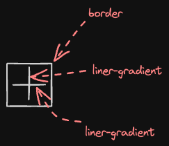
然后,绘制加号(➕)和减号(➖),由于还有外围一个正方形边框,我们可以用伪元素来绘制(当然,这是在可以使用的情况下),好处是可以直接用border画边框,这比用渐变方便的多,然后加号就是两段线性渐变,如下
用代码实现就是
1
2
3
4
5
6
7
8
9
10
11
12
13
14
15
summary {
    display: flex;
    align-items: center;
    list-style: none;
}

summary::before {
    content: '';
    width: 14px;
    height: 14px;
    flex-shrink: 0;
    margin-right: 8px;
    border: 1px solid #999;
    background: linear-gradient(#999, #999) 50%/1px 10px no-repeat,linear-gradient(#999, #999)  50%/10px 1px no-repeat;
}
调整一下间距,效果如下
1
2
3
4
details {
    padding-left: 25px;
    padding-top: 15px;
}
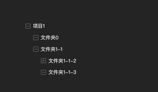
现在都是加号(➕),看不出哪些是展开的,所以还需要绘制减号(➖),可以用 [open] 属性来判断,相较于加号(➕)而言,只需要一个线性渐变就行了,实现如下
1
2
3
details[open] > summary::before {
    background: linear-gradient(#999, #999) 50%/10px 1px no-repeat;
}
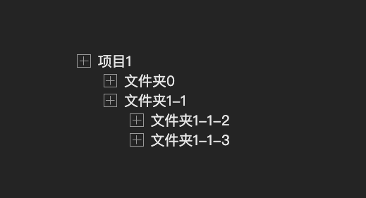
现在就可以区分哪些是展开,哪些是折叠的了
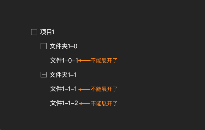
到了这一步,其实还有一个小问题,有些是不能继续展开的,因为已经到了最底层,没有内容了,所以希望在没有展开内容的时候不显示加号(➕)或者减号(➖),这应该如何判断呢?
其实很简单,在没有展开内容的情况下,其实只有summary单个标签,就像这种结构
1
2
3
4
<details>
  <summary>文件</summary>
  <!--没有内容了-->
</details>
提到单个标签,可以想到:only-child伪类,所以可以这样重置一下
1
2
3
summary:only-child::before {
  display: none
}
还有另外一种做法,那就是借助:not伪类,直接在前面的选择器上加一层判断
1
2
3
summary:not(:only-child)::before {
    /*排除单个summary的情况*/
}
这样会更加优雅,效果如下
绘制连接线
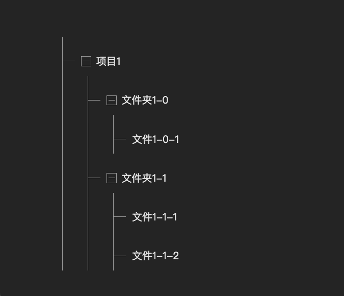
最后就是绘制连接线,也是 CSS 最灵活的、最有趣的一部分。
先从绘制实线开始,这样比较容易。
直接绘制可能有些难度,我们可以分解开来,一部分是垂直的,指向树的每个标题部分,所以直接绘制在 summary 上,还有一部分是竖直的,并且竖直部分会包含整个展开部分,因此可以把线条绘制在 details 上,用代码实现如下
1
2
3
4
5
6
7
8
summary {
  /* 水平线 */
  background: linear-gradient(#999,#999) 0px 50%/20px 1px no-repeat;
}
details {
  /* 垂直线 */
  background: linear-gradient(#999, #999) 40px 0px/1px 100% no-repeat;
}
效果如下
有很多线是多余的,比如树的最后一个节点,垂直线段不应该继续向下延伸了,最左侧的线也是多余的。首先是最左侧的线段,其实就是最外层,也就是第一层,要去除很简单,直接选中第一层的 details 以及下面的 summary 就行了,这里可以用子选择器 > 来实现
1
2
3
4
5
.tree > details,
.tree > details > summary {
  /* 去除最外层的连接线 */
  background: none
}
效果如下
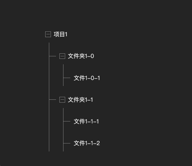
然后就是每层的最后一个子节点,如何将垂直线段去除呢?其实可以从 HTML 结构上入手,最后一层,其实就是最后一个 details,所以将最后一个的背景尺寸改为刚好和垂直线段吻合
1
2
3
details:last-child {
  background-size: 1px 23px;
}
还有一个小优化,现在最左侧第一层都是分开的,看着有些零散,这是因为前面这一步将所有最后一层的垂直线段都去掉了,所以需要还原这种情况,可以用子选择器 > 选到,如下
1
2
3
.tree > details:not(:last-child) > details:last-child {
   background-size: 1px 100%;
}
虚线同样也可以用渐变实现,只不过需要用 repeating-linear-gradient,因为虚线其实是不断重复的从实色到透明的渐变,示意如下
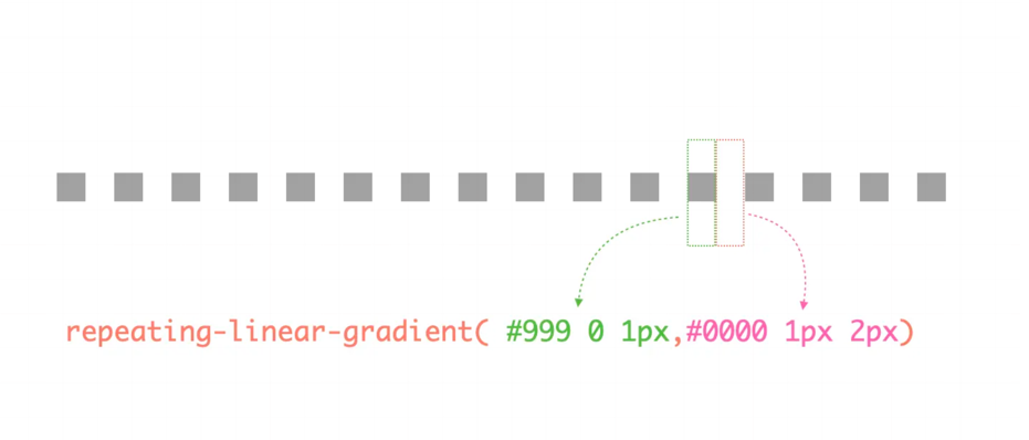
用代码实现就是
1
2
3
4
5
6
7
8
summary {
  /* 水平虚线 */
  background: repeating-linear-gradient( 90deg, #999 0 1px,transparent 0px 2px) 0 50%/20px 1px no-repeat;
}
details {
  /* 垂直虚线 */
  background: repeating-linear-gradient( #999 0 1px,transparent 0px 2px) 40px 0/1px 100% no-repeat;
}
下面是完整 CSS 代码
1
2
3
4
5
6
7
8
9
10
11
12
13
14
15
16
17
18
19
20
21
22
23
24
25
26
27
28
29
30
31
32
33
34
35
36
37
38
39
40
41
42
43
44
45
46
47
48
49
50
51
52
53
54
55
56
57
58
59
60
61
.tree summary {
    outline: 0;
    padding-left: 30px;
    list-style: none;
    background: repeating-linear-gradient( 90deg, #999 0 1px,transparent 0px 2px) 0 50%/20px 1px no-repeat;
    /* background: linear-gradient(#999,#999) 0px 50%/20px 1px no-repeat; */
}
.tree details:last-child {
    background-size: 1px 23px;
}
.tree > details:not(:last-child) > details:last-child {
    background-size: 1px 100%;
}
.tree details {
    padding-left: 40px;
    background: repeating-linear-gradient( #999 0 1px,transparent 0px 2px) 40px 0/1px 100% no-repeat;
    /* background: linear-gradient(#999, #999) 40px 0px/1px 100% no-repeat; */
}
.tree > details {
    background: none;
    padding-left: 0;
}
.tree > details > summary {
    background: none
}
.tree summary {
    display: flex;
    align-items: center;
    height: 46px;
    font-size: 15px;
    line-height: 22px;
    color: rgba(0, 0, 0, 0.85);
    cursor: default;
}
.tree summary::after {
    content: '';
    position: absolute;
    left: 10px;
    right: 10px;
    height: 38px;
    background: #EEF2FF;
    border-radius: 8px;
    z-index: -1;
    opacity: 0;
    transition: .2s;
}
.tree summary:hover::after {
    opacity: 1;
}
.tree summary:not(:only-child)::before {
    content: '';
    width: 14px;
    height: 14px;
    flex-shrink: 0;
    margin-right: 8px;
    border: 1px solid #999;
    background: linear-gradient(#999, #999) 50%/1px 10px no-repeat,linear-gradient(#999, #999)  50%/10px 1px no-repeat;
}
.tree details[open] > summary::before {
    background: linear-gradient(#999, #999) 50%/10px 1px no-repeat;
}